Thursday, December 26, 2013

Face of the Day: The day after Xmas

Now this has got to be my longest blog post. But I wanted to do a really in-depth FOTD(face of the day) post. You know, thought it would be fun.

So lets start with the eyes.
 I started off with a VERY old tube of my Urban Decay Primer Potion in Sin. It is so old that all the writing has rubbed off on it. I really hate the primer, I am just trying to use it up. Although it does hold your shadow in place all day, it also provides every shade you put on top of it with a shimmering champagne cast. That can be really pretty for some people, but on my dark skin it can really look ashy.

For the lid color I took the matte taupe shade from the Kardashian palette. I know what you are thinking. Yes, I was suckered into the hype and shelled out the $13 it cost to buy this palette that everybody seems to be bashing. And even though the packaging is impossibly cheap (it broke after a few weeks of me using it) I actually like the eyeshadow shades. As you can see, I seriously hit pan on the matte taupe color and the ashy brown color next to it, I seriously devoured (I used every last bit on my eye.) And don't get me started on the gorgeous shimmers on the bottom. They are so pigmented and metallic, I feel like it wasn't a complete waste of money.

This palette is the brands best selling item and it is called Kim's Kardazzle Face Palette. From what I see on the website, it looks like the updated the palette a little, new packaging, different blush but the shades seem really similar.

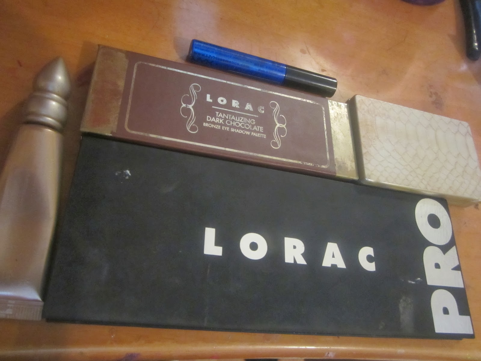
Okay, so for my transition color I used my limited edition Lorac palette (its from the set that is supposed to look like chocolate bars.) I have been straight ABUSING the matte ashy brown color.


Now to talk about my baby: The Lorac Pro palette. I used the shimmery deep purple shade to deepen up my liner. I wanted to try something different that day.


I combined that Deep purple shade with this electric blue liquid liner color by NYX in the color Extreme Blue. I remember what first caused me to buy this liner. I was reading an article in Essence magazine that dark skin girls shouldn't be afraid to take more risks with their makeup. I've worn this liner alone and deepened with a dark shadow. I don't regret my purchase (especially because NYX is sooooo affordable)

 Now on to the face.
 I am not a fan of this bareMinerals Prime Time primer. This is just a sample and I think the full size comes in a spray bottle. It is too oily for me. But if you are the type that doesn't love the silicone feel of other primers or if you have a bit of dry skin then this might be for you. And when I say oily, it doesn't leave my face oily... just when I apply it, oil comes out before the product does. like bad lip gloss.
Everybody says that the Maybelline FitMe concealer is a dupe for the Nars Creamy Concealer. I don't believe it. Even though I have never tried the Nars one... it can't possibly be like the Maybelline. The color selection for the Maybelline is wack and the coverage is lack luster. I got it in the deepest shade they offer and I still feel like it is to shades too light. This is definitely not the kind of concealer you can wear on its own.


 This Bobbi Brown foundation was a graduation gift from my best and I absolutely loved it when I first got it but I don't know what happened but after using half the bottle I am not impressed and more. I feel like it is not that long lasting and when it does wear down it breaks down patchy and in a super unflattering way. Something has changed, I don't know if it is me or the makeup.
  This is actually my second Maybelline FitMe powder in 355 Coconut. Unlike the unimpressive concealer, I quite enjoy the powder. Yes, the powder is too light for me but it is blendable enough for it to not matter. It kind of acts as a highlighting powder.

 My camera didn't pick it up but the powder has a little sparkle in it. (kind of like a highlighting powder)
During my makeup collecting journey I have come to realize one thing. They always say deep plums and raspberries look good on dark skin but I find them a little overpowering for me. This blush is from the Mac Liberty of London collection (I got it from a CCO) it is called Dirty Plum. it is super pigmented so I try to concentrate it on the backs of my cheekbones.


I am just as boring with my lips. I try to stay clear from deep colors that people always say look good on deep skin (like the Mac Viva Glam III I have here.) I lightened up the deep burgundy red color by
putting the CoverGirl Gloss Balm in 210 Blush Twist as a base then topped it with one of my favorite lip glosses, Nars in Belize.
Using two samples as my mascaras, I first used the BareMinerals Flawless Definition to define and lengthen (it is really good at separating, I am definitely buying the full size)
Then I used the Smashbox FULL Exposure to thicken in. (I know I should have switched the order). Honestly, I hate the smashbox mascara. I think it actually makes my lashes shorter.
My tried and true method of putting on my brows.
I use the Jane Iredale Deluxe Spoolie. It is an ordinary spoolie, nothing special.

Then I sue my Mac 208 brush to apply the product to my brows
The powder I love is actually an eyeshadow. Deep Mocha by L'Oreal is my fave.
I hit pan hard body.


Friday, November 29, 2013

Essie Naughty Nautical

 This was such a fun manicure. I know it is fall but I wanted to do something fun and summery so I pulled out Naughty Nautical from Essie Summer 2013 line and did a palm tree accent nail. Naughty Nautical is a gorgeous ocean teal with slight sliver shimmers in it.

Thursday, November 21, 2013

Sinful Colors Ruby Ruby

One of my guilty pleasures is catching Sinful Color nail polishes on sale at Walgreens. This lobster red color is called Ruby Ruby and I wanted a fun new manicure to usher in the holidays.

Saturday, November 16, 2013

NYC Park Ave (246)

 
There is absolutely no law that says you have to at least $8 on a salon nail polish like Essie or OPI to achieve a salon quality manicure. (except for mine, again, please excuse my ratchet cuticles). This gorgeous taupe color from the very affordable NYC (New York Color) brand really has me head over heels. it looks amazing on my skin tone. It is a mixture of gray and brown and gives an almost foundation-like appearance to my hands. (like the RGB foundation nail polishes). This is great for work, and great for fall.
You can find it at your local CVS, Rite Aid, Walgreens.

Monday, October 21, 2013

NYC Empire State Blue(140)

 Now this is a fun cheap find. I never really paid attention to NYC as a brand but they were having a ridiculous sale so I decided to pick up this blue color. I know there is no fun design to accompany it, (sometimes I like to keep it simple) but this is a pretty decent polish for the price. It doesn't compare to the Wet n Wild Megalast line but it is definitely worth a try.

This shimmery blue incorporates a pretty green that is compact but not duo-chromey

Sunday, October 13, 2013

Revlon Whismical


I've never been more on the fence about a polish than this one. As you can see, the bottle looks like loads of fun. It's a milky mint color with lavender and teal hexagonal glitter suspended into it. there are also smaller specs of similar colors floating in there too.
The first time I saw it I desperately wanted it but the second I put it on I realized how disappointing a shade this was. The pictures above are FIVE coats of polish. Needless to say, that manicure never really dried. I was just so shocked that the color was so sheer. I'll retry the polish over a base coat of some sort but I don't want anything to take away from the color itself.

Friday, October 11, 2013

Do I look like Beyonce wearing this Nails Inc. Baker Street color?

 
If you don't know, I'm the type of person that is SLIGHTLY obsessed with King Bey. When I heard her favorite nail polish color was this vibrant cobalt blue shade from the brand Nails Inc., I made it my mission to track it down and add it to my collection.
Honestly, the color and formula are OKAY. Yes, it is an opaque color and it goes on nicely... doesn't chip excessively... but this was nothing special really. It reminds me a lot of the Essie color, Butler Please.... (Beyoncé Please!)


Thursday, October 10, 2013

Maybelline ColorShow Metallics in Bold Gold

I know this might seem a little strange but this polish was the most unforgiving color that I have ever had the displeasure to put on my nails. If you notice, this cheetah and rhinestone design is bomb but I couldn't get over the streaks and unsightly marks this formula showed off. Is it corny to say that this color 'showed' too much?
You can see on my middle finger that I have a press-on nail to match the length of my other nails... That is usually not a problem with other polish but this metallic lacquer made all the harsh filing I did to get that press-on smooth a little too visible.
I don't know, I'm not too versed in the world of metallic polishes, maybe they are all like this.

The color on the other hand, is also not my favorite. It is a gold but has a odd (very fine) silvery shimmer to it.

Wednesday, October 2, 2013

L'Oreal Paparazzi Pleaser

Please excuse the slightly sloppy application but I just had to say how much I love this purple. Fall is here and it is time to put away those bright neons of the summer (if you are one to follow trends, personally I where what I want, when I want). This color by the L'Oreal line of nail polishes is called Paparazzi Pleaser.
I am not the one to love dark polishes on my nails but this purple is not too dark. It is not a scary vampy color but it definitely is not a neon. And don't get me started on the formula! I guess you would say it is a crème but this is more like a shiny gel. The lazy girl wouldn't even need to put a top coat on.
This is a hidden gen that you can't afford to sleep on. It doesn't chip excessively either, average wear.


Sunday, August 18, 2013

Essie Van D'go

Omg, I absolutely love this creamy neautral peachy pink color. My accent nail is this cute teal bow with polka dots. If you are a girl that loves beutral colors or need a color great for work, this polish would be great for you. the formula dries a little more matte than I would like.. just make sure you have a really good top coat. It is a nice spring time color.

Sunday, August 11, 2013

YSL CRÈME DE BLUSH Soft Blush

Hey guys, I know it has been quite a while since I have done a post. I wanted to come at you with this new blush I have been using by Yves Saint Laurent. It is their creme de blush, I bought it at Sephora and it was $38. Yes, it is a bit of a splurge for just a cheek product but I just had to have it. I think it was this pretty gold packaging. All in all, for dark skin sister like me I think I would have to say pass on this product (or at least this color, I got the velvety peach).

As you can see, it comes in this gorgeous gold plated package that looks really good on your vanity.


The texture was a soft almost moussy feel. When you applied it, it reminded me of the Maybelline bouncy blushes. They both rub to a powder finish.
 For $38 you get .19 oz. The product is surrounded with an acrlic casing making it appear like a lot of product.
 So this is what the color looks like. For anybody lighter, it will look like a more natural flush of color. On me however, I just use it as a base to layer other cheek colors on top of.
 
 The color is 1 Velvety Peach - peachy pink. I thought it was going to be sort of like a Nars Orgasm but it is less pigmented than that.